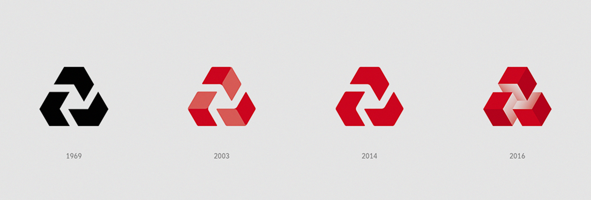
NatWest is a regular feature on the UK high street, and its iconic logo – three chevrons forming a triangle – is etched into the national identity. So, when the bank decided to rebrand in October this year, the pressure was on to get it right!
The new branding, which was created by design consultancy FutureBrand, takes its inspiration from the past. NatWest’s original 1968 logo saw its chevrons filled out to become three cubes joined at the center, symbolizing “three separate banks coming together under the brand”. Those banks were National Provincial Bank, Westminster Bank, and District Bank. In 1969, the logo went from 3D to 2D – presumably to emphasise the fact that three had become one – a new, single, banking entity, with its own identity and culture.
Rebranding to combine both the original 3D structure with the bank’s newer, more impactful, colour scheme, fulfills the brief of making it “stand out from its competitors”. It is also a very clever way of demonstrating that NatWest’s roots go back to a simpler time, when banks were still trusted parts of the community.
FutureBrand’s executive creative director Dan Witchell explains how the logo gave rise to NatWest’s newest branding device – a colourful, narratively rich, blocky form of symbolic story-telling:
“We used this as a jumping-off point, using the cubes as a storytelling device to create illustrations and build stories. It was a gentle evolution of the brand rather than a reinvention.”
Do you like NatWest’s new look?

Describing why he thinks the new branding works, Witchell continues: “if you look at most of the competitors in the banking sector, they use a full bleed, nice crafted photography and a white sans-serif typography – they’re all quite similar. We wanted to create a brand that was different and which stood out.”
NatWest’s new look combines a stable past with a colourful future to create a playfully visual identity that the bank hopes will appeal to new and old customers alike. But has it succeeded?
