
We believe that a simple brand is a powerful brand, and so when one of the world’s biggest and most recognisable companies decided to strip back and simplify their branding and logo, it really grabbed our attention!
The concentric circles of Mastercard, the multinational financial services firm, can be spotted in television adverts, billboards, and both retail and online outlets all over the world. These two little circles have, since 1968, provided a symbol that re-assures customers of reliability, security and ease-of-use.
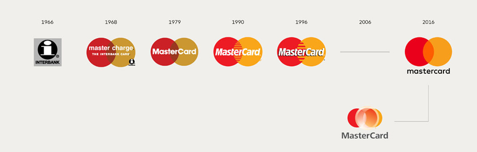
Re-designing a logo that is used across more than two billion plastic cards worldwide is no mean feat, so the new design by Pentagram, was always going to make big news. While the interlocking circles that are known from Nepal to Naples have, of course, been retained, the horizontal lines that framed the word ‘Mastercard’ have been dropped.
The company name, which used to run across the middle of the logo, has been replaced by an orange intersection, to show the coming together of the brand’s two primary colours.
Showing just how important it is to keep your branding up to date and in line with what your country is doing in the present, Chuck Bruel, vice president of brand marketing at Mastercard offered an explanation:
“We’ve expanded all of our products and services and that’s really accelerated over the past few years, so we took a look at the logo and said, ‘I think we can do some things to have it more closely reflect where the company is’. To make it simpler, more impactful in a way, but still instantly recognisable.”