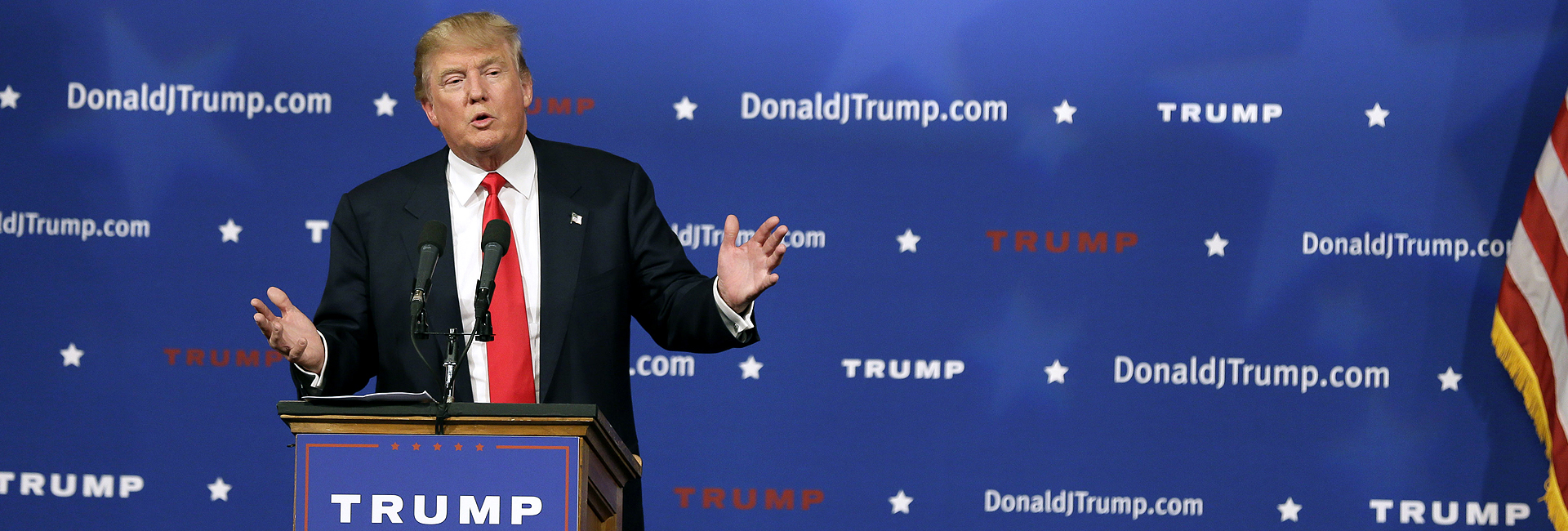
Unless you’ve been living in a cave, on another planet, or on a remote island somewhere, you’ll have noticed there was a momentous election in America this week. Now, months of media coverage has come to an end and Donald Trump will be the 45th President of the United States, yes that’s right: President Trump!
However, while TV news channels and newspaper columns have been full of the two candidates and their confrontation, what has interested me the most has been the branding behind the two campaigns.
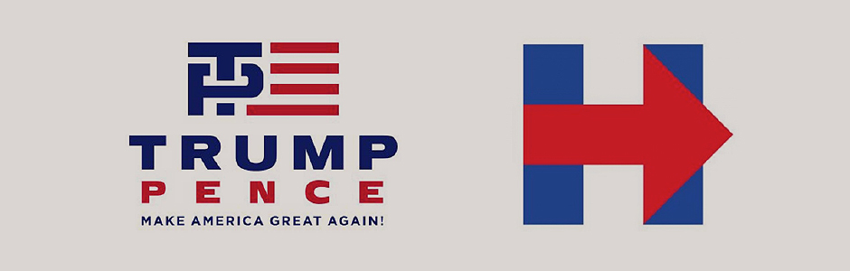
Whether it has been around their speech podiums, across their personal aeroplanes or on campaign buses, both parties were keen to get their branding and their message in front of as many people as possible. The Clinton campaign went with this logo (above) which became synonymous with their campaign, using the red arrow symbolising the candidates desire to move the country forward on a number of issues.
The symbol, created by Pentagram partner Michael Bierut and Jesse Reed, was used alongside a white, custom, sans-serif typeface, Unity, with the colours incorporating the classic red, white and blue of the American flag.
Hillary Clinton’s ultimately unsuccessful campaign was aiming to make her the first female President in the history of the country, something she played on a lot throughout the campaign. A lot of her advertising material and branded merchandise played on the feminist idea, using ‘she’ and ‘her’ across many items, whilst keeping the focus on progression. Eventually this spawned the #ImWithHer hashtag across social media.
The eventual winner, Donald Trump, has been a news phenomenon over the last year, with news broadcasters and print media becoming a fanfare around him and there being some sort of story, positive or negative, in almost every news cycle. Because of this, it was important he has one clear message to speak to his target voters.
The Trump campaign, running with Mike Pence as his vice-presidential candidate opted for this logo initially, with the American flag re-design at the top, and his somewhat notorious slogan ‘Make American Great Again’ at the bottom. This logo was released as Pence was unveiled as the VP candidate, however with the capital T going through the P, some people took an alternative and rude view of the logo and it was eventually scrapped.
After scrapping the logo, the Trump campaign went without an icon, instead opting for ‘Trump’ and ‘Pence’ in bold, sans-serif logotype, along with their slogan and a blue box border with five red stars.
Elections are always a good time to observe how branding and design can help a candidate gain recognition, become memorable or even just stand-out from the rest of the field. In this instance it was the simplicity and safe branding of Trump which turned out on top.